00 GUI And Pyqtgraph Basics
The GUI uses pyqtgraph for image views, histograms, line plots, ROI overlays, and result plots. This page summarizes the interactions that are used repeatedly throughout the app.

Right-Click Context Menu
Most pyqtgraph plots have a context menu. Right-click inside a plot area or on an axis to open it. The exact entries can differ slightly between pyqtgraph versions, but the important functions are usually the same.
Common context-menu actions:
- View All / Auto Range: fit all visible data into the plot.
- X Axis / Y Axis: enable or disable mouse interaction, auto-range, and manual range settings for a single axis.
- Manual range: enter exact numerical minimum and maximum values for an axis.
- Mouse Mode: switch between pan/zoom interaction styles.
- Export: open the built-in pyqtgraph export dialog.
This is useful when the mouse wheel gives an approximate view, but you need reproducible plot limits for presentations, screenshots, or paper figures.
Image Views
Image views are used for the raw data, the channel preview, W seed previews, and the composite result image.
Common interactions:
- Mouse wheel: zoom in and out around the cursor position.
- Left mouse drag: pan the visible image region.
- Right mouse drag: scale the view horizontally and vertically in many pyqtgraph views.
- Auto-range: use the app button if available, or the pyqtgraph view menu, to fit the full image back into the view.
- Channel/slice sliders: move through spectral channels, result components, z slices, or time points depending on the current widget.
If an image appears cropped, zoomed into an old region, or shifted after loading new data, use auto-range to recenter the view.
For exact image view limits, use the right-click context menu on the image view and set the x/y ranges manually. This is mainly useful for reproducible screenshots of the same region across different result components.
Histogram And LUT Controls
The histogram panel controls how image intensities are displayed. It does not change the underlying data unless the image is explicitly exported as a rendered PNG.
There are two related but different concepts:
- Intensity levels: the lower and upper display limits. Intensities below the lower level are shown as black. Intensities above the upper level are saturated.
- Color gradient: the LUT used to map normalized intensities to color. In the result viewer this is usually a two-color ramp from black to the selected component color.
Typical workflow:
- Select the channel or component that should be adjusted.
- Drag the histogram level handles until the component map has useful contrast.
- Change the component color if needed.
- Repeat for the other components.
- Save a preset once the levels and colors are final.
The Reset Black Levels button in the result viewer resets the composite display range to the full 16-bit range:
0 ... 65535
This is useful when a previous channel or slice left the composite view too dark or too saturated.
Exact Histogram Values
Dragging the histogram handles is convenient, but it is not ideal for exact reproducible values. There are two practical ways to get exact values.
The first option is the pyqtgraph context menu. In many pyqtgraph widgets, right-clicking the histogram or axis area allows manual min/max control of the displayed range. Use this when you need an exact range during an interactive session.
The second and more reproducible option is to use presets.
The main JSON preset stores histogram states per component. The important fields are:
{
  "histogram_states": {
    "0": {
      "levels": [0.0, 65535.0],
      "bottom_color": [0, 0, 0, 255],
      "top_color": [255, 0, 0, 255],
      "bottom_pos": 0.0,
      "top_pos": 1.0
    }
  }
}
Interpretation:
levels: lower and upper intensity display limits in image intensity units.bottom_color: low-intensity color, normally black.top_color: high-intensity color, usually the component color.bottom_pos: lower gradient tick position.top_pos: upper gradient tick position.
For reproducible figures, the recommended workflow is:
- Adjust the LUTs visually once.
- Save a JSON preset or histogram preset.
- Reuse the preset for related datasets.
- If exact numeric limits are required, edit the
levelsvalues in the preset.
For example, this fixes component 1 to the full 16-bit display range:
"levels": [0.0, 65535.0]
and this clips the display to a smaller range:
"levels": [250.0, 12000.0]
The histogram tick positions are separate from the intensity levels. The intensity levels define the numerical black/white display range. The gradient tick positions define how the color ramp is distributed between these limits. In most normal use cases, keep the lower gradient tick at 0.0 and the upper tick at 1.0, and adjust only levels.
Zooming And Auto-Range
Most image and plot widgets preserve their current view range while data are updated. This is useful when comparing slices or repeated analysis runs, but it can be confusing after loading a very different dataset.
Use auto-range when:
- a newly loaded image appears off-center;
- a component map is visible only partly;
- the plot axis range is too large or too small;
- you changed from a small image to a large image or the other way around.
For image widgets, auto-range means "fit the full image into the visible view". For spectral plots, auto-range means "fit all visible curves into the plot area".
If exact plot limits are required, right-click the plot, open the x-axis or y-axis controls, and enter the desired minimum and maximum values. This is useful when two figures should use identical y-axis scaling.
ROI Interaction
ROIs are pyqtgraph graphics items. Their exact behavior depends on the ROI type, but the common interactions are:
- Drag inside the ROI to move it.
- Drag ROI handles to resize it.
- Click an ROI or its table row to select it.
- Use the ROI Manager table to rename it, assign a component number, change the color, or remove it.
The ROI average plot updates from the selected ROI spectra. If custom channel labels are used, the x-axis is shown as Channel rather than a physical wavelength or Raman-shift axis.
Spectral Plots
Spectral plots are used for:
- ROI average spectra;
- loaded seed spectra;
- Gaussian/model seed spectra;
- PCA loadings;
- NNMF or fixed-H NNLS H components.
For numerical spectral axes, the x-axis is shown as wavelength or Raman shift. For custom string labels, the plot uses channel positions internally and labels the axis as Channel.
Use the spectral plot to check:
- whether H spectra match expected resonances or dye channels;
- whether seed spectra and result spectra agree;
- whether component labels and colors are consistent;
- whether a component is dominated by background or acquisition artifacts.
For presentation figures, set the y-axis range manually from the pyqtgraph context menu if the spectra should be compared on the same scale.
If custom channel labels are active, pyqtgraph still uses numerical channel positions internally. The app displays the axis as Channel and uses the custom labels where supported.
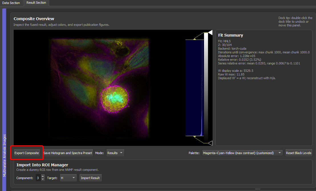
Exporting Images
The result viewer has two different export concepts.
Use Export Composite for the composite image:
- TIFF export saves data, LUTs, labels, physical pixel size, and 4D hyperstack axes for Fiji/ImageJ.
- PNG export saves the currently rendered composite image at the result image resolution.
- PNG export can optionally draw a scale bar into the exported image.
Use TIFF export for quantitative work and Fiji-compatible downstream analysis. Use PNG export for figures, slides, and quick visual sharing.
Pyqtgraph itself also has a right-click Export action for many image and plot widgets. This is useful for quick screenshots or debugging. For final composite images, prefer the app's Export Composite button because it knows about component LUTs, labels, physical pixel size, and optional scale bars.
Exporting Spectral Plots
Use Export Spectra in the spectral plot panel to export the visible H/component plot.
Supported formats:
- PNG for raster figure panels.
- PDF for vector-style plot output.
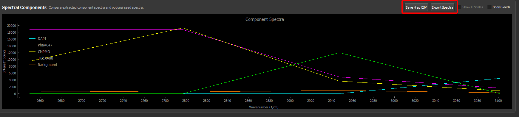
The export dialog asks for a maximum width and height. The app preserves the plot aspect ratio, so the final PNG may be smaller than the requested bounding box in one dimension. This avoids distorted text and avoids large blank margins.
For PNG, the dialog also offers a transparent-background option. This is useful when the plot should be placed on a dark or colored figure background.
Use Save H as CSV when the numerical spectra should be plotted externally or analyzed in another program.
The pyqtgraph right-click Export dialog is also available on many plots. Depending on the installed pyqtgraph version, it can export:
- image files such as PNG;
- SVG vector graphics;
- CSV data tables;
- a Matplotlib window.
The Matplotlib export is especially useful when the plot should be restyled for publication or presentation. A practical workflow is:
- Use the GUI to generate and inspect the result.
- Right-click the spectral plot and choose Export.
- Select Matplotlib to open the data in a Matplotlib figure.
- Adjust fonts, axis labels, line widths, and layout in Matplotlib.
- Save the final figure panel from Matplotlib.
For publication defaults such as fonts, mirrored ticks, vector text export, and save dpi, see Publication plots with Matplotlib rc defaults.
Use the app's Export Spectra button when you want a fast direct PNG/PDF from the GUI. Use pyqtgraph's built-in Export menu when you want raw plot data, SVG, or a Matplotlib handoff.
Built-In Pyqtgraph CSV Export
The right-click pyqtgraph exporter can export plotted curves as CSV. This is different from Save H as CSV.
Use pyqtgraph CSV export when:
- you want exactly the curves currently visible in the plot;
- you want to quickly inspect plotted x/y data;
- you are exporting a temporary plot or diagnostic view.
Use Save H as CSV when:
- you want the actual spectral component matrix
H; - you want a stable analysis output;
- you want custom channel labels or spectral-axis metadata in the exported table.
What To Check Before Export
Before saving final figures or presets, check:
- all component labels in the ROI Manager;
- component colors and LUT ranges;
- whether custom channel labels or physical spectral units are correct;
- physical pixel size and scale bar length;
- whether the view is auto-ranged or intentionally zoomed;
- whether the result is a single 3D result or a 4D z/time result series;
- whether the exported file should be quantitative TIFF, rendered PNG, spectral PNG/PDF, or CSV.
This checklist prevents most common figure-generation mistakes.